Information Visualization
Introduction
You visualize data to simplify and dramatize an insight for your audience. You are offering a valid conclusion that they could come to on their own if they were to spend time with the data, but you are saving them time by drawing their attention to what matters most. You may also use visualization techniques to think about the data, to discover patterns, to play "what if", to play "if this, then that", to find correlations, to find the focal point from which to make the next decision. Much of the time, however, you will be summarizing data for an audience that needs to make a decision.
| ▲▲▲▲ ▲▲△▲ ▲▲▲▲ ▲▲▲▲ |
You don't need to know what the triangles represent to see that the third one on the second row is different from the others. What is that difference? Well, visually it is the only one that isn't filled in. That's what drew your eye to it. But what does its difference indicate? That requires interpretation and interpretation requires context. A difference has to make a difference to be a difference. |
The foundation of all critical thinking, visual, textual, aural, is collection and division, comparison and contrast. We group like things together and separate dissimilar things. We are not just talking about opposites but also degrees and types of similarity and difference. Frequently, we can more rapidly and therefore effectively communicate similarity and difference using images rather than words. Which of the following triangles is not like the others?
In Semiology of Graphics: Diagrams, Networks, Maps, Jacques Bertin, one of the earliest theorists of information design (1967) identified seven visual concepts important to visual understanding. When we see any of the following seven attributes represented visually, we can infer meaning without consciously thinking (decoding). Instantaneous recognition is the source of visualization's power. Stephen Few, refers to these concepts as "Pre-attentive attributes," which helps underscore the idea that good graphics convey meaning instantaneously, with little or no conscious effort on the viewers' part. (Stephen Few, Now You See It)
Creating such powerful graphical representations takes insight into the data, what is important to the audience, what isn't. Effective visualization also requires some knowledge of software packages. Excel is a business standard that you should spend your free time (like you have any, eh?) becoming an amateur expert in. But there are other tools more specifically designed for graphical representations (Tableau, for example), and you should spend some time looking for and learning how to use them. Google Drawings is a handy, free, place to start.
What follows is a broad overview of the primary techniques for creating effective visuals that will help you get started representing data to yourself and to your audiences, but you will need to practice, and you will need to read more widely. (The WSJ Guide to Information Graphics, Good Charts.)
- Size (quantity -- bigger means more, smaller means less -- proportion -- greater area suggests amount of difference between data points)
- We are pretty good at recognizing size differences, so size is an effective information representation tool, but from your perspective as a designer of the graphic, getting the proportions right can be tricky. If the software you are using is doing the drawing based on the numbers you give it, no problem. But if you have to eyeball the proportions it's easy to get it wrong.
- 🏠 🏠 How much bigger than house icon 1 is house icon 2? 50%, 100%, 300%? More or less? 📖. Unless you can scale an image precisely and your audience can accurately infer the scale, the image will add drama by subtracting precision. If the general idea is most important (because you are displaying the graphic in a ballroom where close-up inspection is impossible, and you have nearly no one's full attention) then roughly scaled images work well. You can always provide the data separately, in a footnote or in a table. Ideally, however, whatever digital tools you are using to store your data should enable precise visual representations of that data.
- If dramatizing quantitative difference is your goal, size makes visual sense.
Pie charts are notorious for misleading or confusing representations of proportion. Excel makes them easy to make, but if you have more than 5 or 6 slices, the segments will be hard to interpret even if each one is labeled and color coded. That many labels make the chart hairy and more than 5 colors are hard to keep track of. If you do have to use a pie for some reason, consider using shades of a single color since the proportion of the whole is the point, not each slice individually.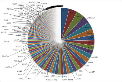 Inedible Pie Chart: Source
- Value (order -- hierarchy) -- what comes first or sits on top is greater than what comes after or sits lower. Perhaps the most common representation of hierarchy is the organizational chart, a pyramid shape with report lines. A leaderboard (an ordered list) is another common example. You want an ordered list or a layered diagram any time you can usefully rank the items in your data set.
- The easiest way to represent a hierarchy is with an ordered list. You could just write 1) item, 2) item, and 3) item, in a line, like all the other words in your text. But you could make the hierarchy more vivid by using a vertical layout.
- item
- item
- item
We could further emphasize the hierarchical arrangement using a different color for each item, but the added information wouldn't add meaning because what we have here is just an ordered list. In a subsequent example on this screen we will color code first, second, and third with gold, silver, and bronze because we will be talking about a foot race and so the Olympic gold/silver/bronze convention makes sense there. At that point, the color scheme will be information rather than decoration. Decoration runs the risk of being noise.
Shape can be a useful organizing principle because our eyes are drawn to shapes and we are inclined to assume a shape has meaning. You can use a shape to suggest something without actually saying it directly, like when you represent something as pear-shaped (sagging) or rocket-shaped (rapidly ascending). You can use a shape to visually isolate one piece of information (the main point) from other information around it (the context). If you were designing a magazine layout, for example, you could put the key quotation in a box or a circle in the center of the page. A pyramid shape is an effective way to represent a hierarchy, the top being on top and smaller than the rest, thus suggesting prestige and rarity, two key principles suggesting superiority. Also, the pyramid is a familiar image to most people. You could also invert a pyramid if you needed to stand an expectation on its head. Icons (shapes that look like what they represent) are the most common way of using shape to quickly present information visually.Shame, Anxiety, Eat, Shame, Anxiety, Eat, Shame, Anxiety, Eat, Same, Same,
- Some common, if oddly anachronistic examples: ✉ ✎ 💾
- Some shapes are quickly identifiable because they visualize an object or an action: 🎓 🚮
- Some shapes are quickly identifiable even though they don't resemble a specific object or action: 🚫
- And then of course there are symbolic representations of emotions and attitudes (Emoji): 💩
- Position -- relative to the center, to the front, to the back, or to other items in the frame. Things set contiguously (side by side) are related. Things set at a distance are different, the greater the distance, the greater the difference. Things inside a boundary are related. Things outside a boundary are separate. Things in the foreground are more important than those in the background. Things in the center are more important than things in the edges. Sometimes the center is actually a focal point, not physically the center but that which the eye is first drawn to. By western reading conventions, the upper left-hand corner of a text is the starting point, not the center of the page. But if you were to isolate something in the center of an otherwise normal page of text, that would draw the eye first.
Below is a business quadrant (aka a matrix diagram). This one represents a Strength, Weakness, Opportunity, Threat (SWAT) analysis. Typically you would see several dots in each quadrant at various distances from the center. The dots might vary in size, suggesting something about magnitude on a fifth dimension (expense perhaps). But generally speaking, less information communicates more: avoid too much information. Given this example (hover mouse over dot), any dot toward the top left would be a great opportunity, low hanging fruit, to use the cliché. Anything in the upper right might be a risk worth taking, but cross the middle line into the top right quadrant and you are entering the danger zone. Anything in the lower right quadrant is a serious threat. Any data point near the center in any quadrant is close to neutral.
Opportunity Threat Strength ● Jump on it ● Deal with it ●Weakness ● Tool up Run screaming
- Pattern or texture -- grouping/separation. Data points with significant similarities should be represented by similar patterns (or similar shapes). To indicate a difference in a given data point or group of data points, use a different pattern.
- ⊞⊞⊞ ⊠
- You can also use recognized patterns to help your viewers quickly identify what you want them to see.
●●●●●
●○●○●
●●○●●
●○●○●
●●●●●How many white dots? - The meaning of the difference you draw your viewers' attention to should be easily interpreted. Be careful about being subtle when using graphics. Graphics are meant to be big gestures. Subtleties are easily lost on an audience. The middle umbrella is vividly different from those around it, but what does that difference mean? If the context doesn't make that difference meaningful, the graphic needs to be rethought.
☔ ☔ ☔ ☂ ☔ ☔ ☔
- Color (saturation) -- light to dark is the best way to indicate different values on a continuum for the same object;
- The following example suggests proportional increase in an amount of something, from less to more.
The transition in amounts of the color red (the saturation) would seem to be the main point with this design. Since the main point is variation in saturation, the color you choose doesn't necessarily matter. But you could use a color that is evocative of some quality. Maybe you would choose your client's color palette as a way of making them feel at home. Maybe you would use your corporation's color palette because they require you to. Maybe you would use colors that somehow reflect the object you are quantifying: shades of green to represent decreasing carbon emissions, for example.
- Different colors (hue) are a good way to differentiate among objects. Don't use more than 5 or 6 colors and make sure they are clearly different colors. In the example below, depending on how well you see colors, block 2 and block 5 might look too much alike to be helpful. For other people, the difference will be obvious. Be thoughtful.
- Contrasting colors suggest specific kinds of difference. Two opposing colors (black white; gray/amber), suggest opposite qualities, on or off, present or absent, for example. In the example below, there are 999 gray dots and 1 amber dot. That suggests 1 in 1000, a ratio of .001%. You could just say 1 person in 1000, but visualizing the quantity of the sample and emphasizing the .001% by a color contrast helps make the point more vividly. ●●●●●●●●●●●●●●●●●●●●●●●●●●●●●●●●●●●●●●●●●●●●●●●●●●●●●●●●●●●●●●●●●●●●●●●●●●●●●●●●●●●●●●●●●●●●●●●●●●●
●●●●●●●●●●●●●●●●●●●●●●●●●●●●●●●●●●●●●●●●●●●●●●●●●●●●●●●●●●●●●●●●●●●●●●●●●●●●●●●●●●●●●●●●●●●●●●●●●●●●
●●●●●●●●●●●●●●●●●●●●●●●●●●●●●●●●●●●●●●●●●●●●●●●●●●●●●●●●●●●●●●●●●●●●●●●●●●●●●●●●●●●●●●●●●●●●●●●●●●●●
●●●●●●●●●●●●●●●●●●●●●●●●●●●●●●●●●●●●●●●●●●●●●●●●●●●●●●●●●●●●●●●●●●●●●●●●●●●●●●●●●●●●●●●●●●●●●●●●●●●●
●●●●●●●●●●●●●●●●●●●●●●●●●●●●●●●●●●●●●●●●●●●●●●●●●●●●●●●●●●●●●●●●●●●●●●●●●●●●●●●●●●●●●●●●●●●●●●●●●●●●
●●●●●●●●●●●●●●●●●●●●●●●●●●●●●●●●●●●●●●●●●●●●●●●●●●●●●●●●●●●●●●●●●●●●●●●●●●●●●●●●●●●●●●●●●●●●●●●●●●●●
●●●●●●●●●●●●●●●●●●●●●●●●●●●●●●●●●●●●●●●●●●●●●●●●●●●●●●●●●●●●●●●●●●●●●●●●●●●●●●●●●●●●●●●●●●●●●●●●●●●●
●●●●●●●●●●●●●●●●●●●●●●●●●●●●●●●●●●●●●●●●●●●●●●●●●●●●●●●●●●●●●●●●●●●●●●●●●●●●●●●●●●●●●●●●●●●●●●●●●●●●
●●●●●●●●●●●●●●●●●●●●●●●●●●●●●●●●●●●●●●●●●●●●●●●●●●●●●●●●●●●●●●●●●●●●●●●●●●●●●●●●●●●●●●●●●●●●●●●●●●●●
●●●●●●●●●●●●●●●●●●●●●●●●●●●●●●●●●●●●●●●●●●●●●●●●●●●●●●●●●●●●●●●●●●●●●●●●●●●●●●●●●●●●●●●●●●●●●●●●●●●●- You can capitalize on existing color conventions. One of the easiest ways to offer a progress report, for example, is to color code the elements as green for on schedule, amber for challenged, and red for behind, as in go, caution, stop, like a traffic light.
● The matterials have arrived. ● Two of the expert installers are finishing another another job. ● The clients' check hasn't cleared. - Colors have connotations that vary from culture to culture. White, for example, is the color of mourning in Japan. In China, red is auspicious. In America, white means pure and red means hot. Given globalization, it is important to be both aware of cultural differences, because you might find yourself working with people living in different parts of the world, and also aware that as we have more contact with others from elsewhere, some deep cultural differences are shallowing out. Remember also that 8% of men and .6 % of women are color blind. And most people over the age of 40 can't see blue lettering on a black background very well. So be thoughtful and context aware when choosing colors.
- Orientation -- the relative position and direction (if it is moving) of something in relation to something else that is held as a constant. A map is the most common example, where direction and position can be understood in terms of points on a compass relative to North. The shape of an object in three-dimensional space might change based on the viewer's orientation to it. Unless you are looking at a uniform sphere, the angle of observation, your orientation to the object, will matter.
- The marks on either side of the vertical bars below can be seen as ascending and descending, the first heading off into the distance and second coming towards us. We see them this way because we are oriented feet on the ground. If we were to flip our position 180 degrees, the first marks would seem to approach and the second to recede. When designing a graphic you need anchor the viewer, make sure they know where 0 is and how everything relates to 0. If the perspective shifts, alert the viewer by some means. If you don't indicate where the anchor is, a person will either be confused (or skeptical) or they will assume a given point is the anchor and interpret from there.
- / \ | \ /
- One of the most common forms of disorientation is created by messing with the y-axis on a two-dimensional graph. People who can read a graph assume that the bottom of the Y-axis is 0. If it isn't, their orientation toward the information is skewed.
- Here is a vivid example from Wikipedia. Both graphs represent the same data, but the graph on the left suggests a huge variation whereas the graph on the right suggests little. If you look at the bottom of the y-axis, you can see why.
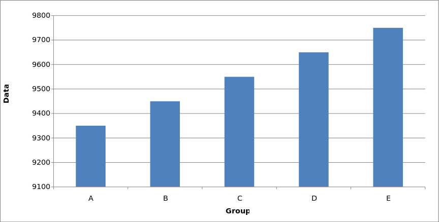
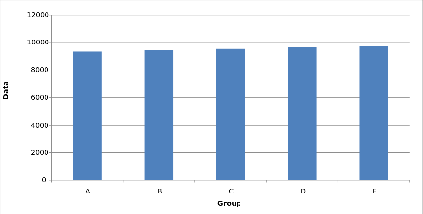
By Smallman12q - Own work, CC0, source
- Setting the y-axis to something other than zero is a common means of deception. Y-axis distortion deception can work because viewers often assume their default orientation rather than verify it. Always check the orientation.
Key Data Concepts
- Nominal data -- name, category, type, product
- Ordinal data -- order, rank
- Interval data -- the difference between ordinal values by a unit of measure
- Ratio data -- percent of a whole value, 0 = none, 1 = all
- Frame -- the boundary, physical or metaphorical, that focuses the viewer's attention on specific features and thus excludes or hides other features. Frames create power, but they can be misleading. To be a critical viewer of charts and graphs you need to be aware the frames.
Some visualizations are depictions of concepts rather than data. We often call these infographics. Charts, another concept you have heard are graphical representations of trends in data. Charts are designed for people who have to make decisions based on data they aren't likely to scrutinize carefully (or understand fully if you want to be cynical about it), trusting that the researchers' did their work correctly. Graphs are more specific, data-centric, fine-grained, visualizations of the data, used primarily by the researchers and designed to help see the data in different lights, to clarify relationships, and identify trends. Generally speaking, graphs are used by researchers to understand the data; charts are used by business people to promote decisions based on the data, and the chief difference tends to be the level of detail. Graphs are data-centric. Charts are idea-centric. In practice, the two words are used interchangeably, but you should still know the difference.
When you are looking at a chart that someone else made, you should ask questions about the ideas that the images represent, but you should also ask some basic questions about the data: where did it come from, how was it acquired, what methods were used, how does it relate to previous data, how does it defend itself against competing data. Not all data is equal.
People can garner a lot of press, and business, by finding astonishing trends in large, publically available, data sets by using computational pattern recognition techniques or sorting algorithms. Data mining, as it is called, can lead to valid insights, but it can lead to junk science and weak justifications for dubious beliefs, most commonly in the form of astounding correlations. If the patterns discovered are dubious or actually misleading, the process of their derivation might be called data pillaging or data grubbing. (see, Gary Smith's Standard Deviations)
For the purposes of Workplace-Based Writing, graphical representations of small data sets are enough. Remember that we are interested in small sample sizes, real users/clients and so most of the power of statistics derived from data isn't relevant for us in this class. Most of our data will be observed and or acquired.
Concrete Worked Example
Let's work through a simple example to think about the kinds of data we can gather and what can be done with each kind. The scene is a regional Olympic trial for the 100-meter sprint. We have three runners and we are there to see them run (observational data acquired by approved time keeping devices).
What stories will our data let us tell?
Nominal data
Ordinal data
Interval data
Ratio data -- percent of a whole value, 0 = none, 1 = all
Frame -- the boundary that surrounds an object, a way of focusing a viewer's attention.
Graphing the data
If there were just one race and all the data we had was acquired by our observation from a reasonable vantage point, the visual representation of the data would be trivial. We would just need an ordered list (because all we have is ordinal data):
- Belawa
- Sinclair
- Hernandez
That's pretty much the end of the story. We could interview the runners, see how they felt about their race, ask them about their training practices and plans for the future (although given that they just sprinted 100 meters there's not much chance of an in depth interview, maybe just enough time for them to plug a sponsor.)
Let's say our 3 sprinters ran 5 races. If this were true, we could express a ratio of places for each runner. Let's say the order remained the same. Then we could express each runner's win to ran ratio: Hernadez: 5 races, 0 wins; Sinclair: 5 races, 0 wins; Balewa: 5 races, 5 wins. Putting that data in a linear, sentence like, fashion makes it kind of hard to read. A table layout would make the ideas easier to see.
               Races Won    Races Lost
Hernandez          0             5
Balewa             5             0
Sinclair           0             5
That chart loudly proclaims Balewa the faster sprinter. It does so by separating the other two runners into the lost category. Given that the purpose of the races was to select the best runner to go on to another level, the relevant story is "Balewa Wins!" The headline is all that matters and the data hardly matters at all. If you told the story that way and didn't give any data to back it up, the story would be over. Sinclair and Hernandez would be forgotten and their experience, or at least their times, would be lost.
Let's say we kept more detailed data, not just names (nominal data) and ranks (ordinal data) but also times (interval data). What stories might the following data table enable?
   Race         1          2          3        4         5
Balewa         9.5       9.7        9.6      9.9      9.4
Sinclair       9.9      10.2        9.7      9.9     10.0
Hernadez      10.5      10.3        10.0     9.9      9.7
Line Graphs
The purpose of a graph is to visually compare and contrast variables, to make similarities and or differences pop! We could just print a table and let the reader figure it out, but that would take time and likely lack impact. Visualization tells the story at a glance. But what story depends on the data and how the data is represented.
Line graph (change in a variable over some constant, often time)
With our sprint case, we plotted times for each runner for each race, we might see a trend we could use to tell an interesting story.
Even though Hernadez lost the first three, she tied everyone in the fourth and beat Sinclair in the fifth. That story would be even more dramatic if a viewer were lead to realize that each successive race was Hernandez's personal best. What's the story with Balewa? The best sure, but what happened in race 4? A three-way tie! What's that about?
Bar Graphs
Column graph (nominal data -- what or who and how much)
Whenever you read or hear someone say "for the sake of simplicity" or "other things being equal," think critically: simplification is sometimes a way to distort or mislead. At any rate, for the sake of simplicity, let's average each runner's times so we can create a relatively straight forward looking column graph.
Given our example, with nominal data (names) on the bottom (the horizontal or x-axis) and ordinal data (average time for each runner) along the y-axis (vertical), we would see something like
This visualization has problems. The times are set from 0 going up, which is what you would expect to see on a bar graph. But we are graphing races, where more is less good, so Hernandez looks like she won even though she lost. If you were to run you cursor along the lines you would see actual data, which could help a reader make sense of what they were looking at. Also, the color of the lines is bronze, silver, gold, which uses the Olympic convention depicting order and so might help a reader understand what they were looking at. But the colors are not obviously bronze, silver, gold and they would vary monitor to monitor. The best use for a column chart is to show quantitative differences where more is higher and less is lower. If you are comparing different nominals (products sold, sale by region), then each column should have a vividly different color and each should be labeled or a legend provided. If the nominal data remains the same but the quantitative data changes, then use the same color for each column, letting the difference in the height of each column tell the story.
Given that our column graph is unhelpful, would our readers have an easier time if we swapped out our silos for swim (or race) lanes, our columns for bars?
This visualization is similarly confusing because it also makes Hernandez seem the winner, at first glance anyway. Clarity at a glance is always our primary goal with graphs. We could flip the time, start with 11 and count down to 5, but that would confuse people because the general assumption is that time starts at 0.
If our data reflected some kind of endurance test, where duration was measured on the X axis, then this bar chart would work because the longer the bar, the better the result. All we would need to do is change the color scheme so that taller was gold, shorter was silver, and shortest was bronze (although again those colors are better on paper than on a screen).
If all we want is to report the results of a single race, a simple ordered list would be the most meaningful visualization.
- ) Balewa
- ) Sinclair
- ) Hernandez
Histograms
How you choose to represent data depends on the data you have and the story you are trying to tell. Sometimes you can look at the data by simply plotting it on different graphs and thinking about how each representation helps or hinders a particular story.
Histogram (interval data -- distribution of the frequency of events on a continuum)
Histograms superficially resemble bar graphs in that they have columns too, but the columns in a bar graph don't touch, they represent discrete objects (nominal data) rather than classes of objects. With a histogram, the area of the bars indicates the frequency of occurrence. If, for example, most sprinters have times in the 10.2 - 10.5 range, then that bar would have a greater area than the others.
Historgram enabled by GoogleCharts
Notice now that our star runner, Balewa, is now just one of 6 star runners, one of whom is Sinclair. The huge difference between Gold and Silver in the heats is minimized when represented in a histogram, as an average among averages along a continuum of times. Notice also that now Hernandez, who was a whole second behind Balewa on average, and got only bronze in our races, was better by several seconds than 4 other runners.
Our observational data, the 5 races among 3 runners that we witnessed tell one set of stories. But place that data inside other data sets and the available stories change.
scatter plot
Scatter plot
Fishbone
Visualization as Heuristic
 Some ideas are better understood when seen rather than heard or read. Take "the fallacy of composition" for example. If all Bs are As, it does not follow that all As are Bs. Make sense? Let's say you meet someone who is 6'5." Do you think the chances that he plays pro or semi-pro basketball are better or worse than average? Well, nearly all basketball players are tall. But there are billions of people in the world. Look again at the image left. Does seeing help understanding?
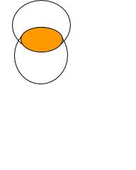
As you may recall from the section of cognitive fallacies, people have a tendency to over-generalize from their personal experience. What we know by experience we assume is universally true, whereas we may have a very skewed sample. Imagine an ellipse. Now imagine it isn't an ellipse but rather the space created by two intersecting circles. When you are focusing on the ellipse (what you see first and therefore assume is universal), you fail to see the circles that made it. Visualization can enable critical thinking, but it can disable it as well.
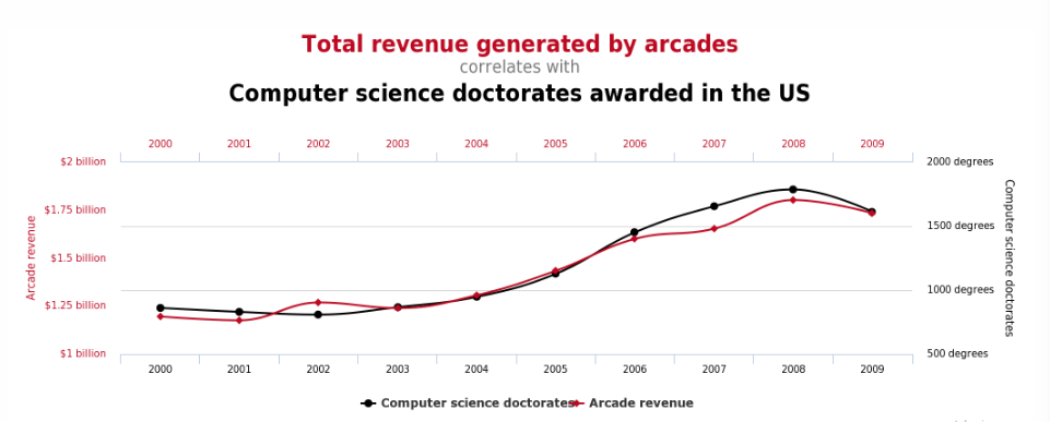
If someone says, the majority of X have Y characteristic, it is very easy to incorrectly conclude that Y causes X. This error in judgment is easily reinforced by a chart, one that might fairly indicate what the data indicates, and yet still be misleading because the observable trend isn't caused by what we think it is. Consider this:
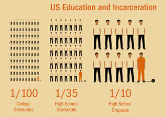
I've given you this graph out of context, so you should be suspicious of it. I have at least given you the link to its source, so maybe you needn't be all that suspicious of me. At any rate, how you read this image depends less on the data and more on your interpretation of the image and that, in turn, is determined by your assumptions. The image left indicates that there are relatively few college graduates in prison and that the chances of a person being incarcerated go up as their level of education goes down. A simple line chart would make this point more vividly:
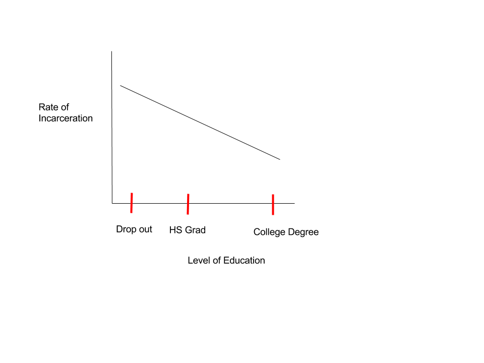
That line chart (notice I didn't' say graph -- no data) would readily suggest a causal relationship between education and law-abiding behavior and also the reverse. Given that assumption, the following image might suggest a great many things about state fiscal priorities.
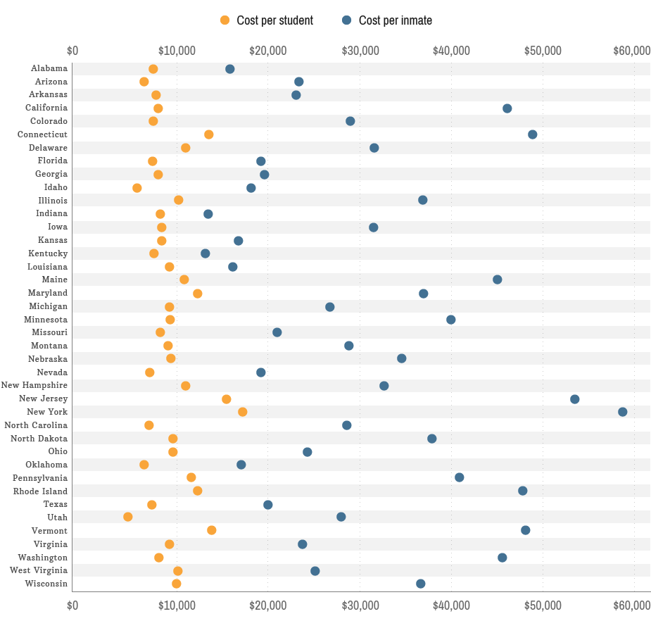
The states represented here spend far more on incarceration than on education, for example. If we think increased spending on education leads to more educated people, and more educated people obey the laws, then the chart would make us think the dots should be inverted. But before we jump to conclusions, let's think a bit more critically. An expression like "as education goes down, incarceration goes up" is a passive-voice generalization (A disembodied assertion without evidence other than the chart). At best the chart offers a statistical observation. We would be wrong to infer from a statistical observation that if a specific individual drops out, she will end it up in jail. Individuals aren't statistics, even though if you have enough individuals you may be able to draw statistically valid conclusions.
Let's look yet more closely at the suggested causal relationship between lack of education and incarceration. Some of the people in jail got there as juveniles, and so for them, incarceration caused lack of education. Mental illness and severe behavioral problems like impulse control and anger management could cause a lack of education and an abundance of law-breaking. Consider also that it takes personal discipline and a supportive group of family, friends, and acquaintances to graduate from high school and even more so from college. So the graduates might be more disciplined and better socialized and therefore more law-abiding, but their character and circumstances led to their education, not the other way around. Had they "fallen in with the wrong people" or had indifferent parents, they might have dropped out, and yet they still might not have broken the law. And then there are at least a handful of random disasters, like a kid from a relatively stable family who went to a house party with a bag of marijuana and got arrested when the party spiraled out of control and the cops grabbed everyone they could get their cuffs on. People making careful data sets have statistical ways to control for random events, but we tend to think simplistically when we are presented with a smooth curve. Once we start thinking about alternative causal explanations, the possibility of meaningful outliers, and so on, we start to think critically.
If we look again at the chart that shows money spent on education and incarceration, but this time we are suspicious of the assumption that lack of education leads to incarceration, we might interpret the chart differently. Maybe now we notice that the cost of education is relatively consistent whereas incarceration expenses vary more widely. We might notice that it costs more to go to school and more to go to jail in NY than anywhere else. Georgia spends relatively little on both. Hmmm. We might also notice that some states are spending much more on incarceration than others. Does that mean those states are more dangerous (more criminals) or safer (more criminals incarcerated) or neither? Perhaps the states spending less on incarceration have offloaded the cost to for-profit jails. Clearly, we really need much more information than what we see on the charts. We need more data and we need to question the ways the data is represented.
- Where did the data come from?
- How was it generated?
- How old is it?
- What was the source?
- And what, if anything, does the source tell you (unreliable witnesses can still tell the truth)?
While it is true that graphical representations of data can be misleading, often because they oversimplify, it is also true that simplification can lead to insight. Visualizations can help us think. Make a to-do list for your next month, everything you can think of you need to deal with every day for the next 30 days. Scary? If you made an itemized list, it might be long enough to make you start procrastinating right away. If you were to sort your list into the following visualization-by-category matrix, also known as the Eisenhower Decision Matrix, you might feel a bit more in control and ready to get to work because you will know how to focus your attention.
| Urgent | Not Urgent | |
| Important | 📌 | 📌 |
| Not Important | 📌 | 📌 |
Separating the long list into shorter lists is part of what makes this visualization work, but another significant part is being able to focus on what needs focus, schedule what needs scheduling, delegate or relegate to off hours those things that are urgent but unimportant, and finally setting aside the stuff you don't really need to deal with at all, unimportant/not urgent. What you put in those 4 boxes depends on who you are and what your goals in life are. But those four categories make quick sense of nearly anybody's workload. Every time you get a new task, you can place it on the board in its appropriate category and now you know how to deal with it. Without the boxes to put things in, everything gets the same treatment and you start to feel overwhelmed. Some tasks get dropped. Some get too much attention. And soon your goals are being derailed by your life.
Experience Maps
Using a wide angle lens can be especially helpful for thinking about customer service experiences because they are an abstract product (invisible) and therefore hard to see (think about). As James Kalbach observes in Mapping Experiences "organizations are out of sync with what the people they serve actually experience [because they are] focused too much on internal processes." You could argue that being too focused on internal processes is the heart of all communication problems. At any rate, if you think about a product as a series of customer/business interactions rather than just as an object for one-time sale, you think clearly about how a person's experience of the product is shaped by the process that led them to get it. If you could see clearly the process that led them away from getting the product, that would give you a chance to get the customers you missed. Since you can only infer the experiences of non-customers from what you can learn about actual customers, reaching the people who never showed up is very difficult. Still, if you know what your customers are feeling as they interact with your product from awareness to re-order, you may see the "touch points" as Kalbach calls them that are rough enough to have sent the less highly motivated, potential, customers away.
Consider your university's wayfinding processes from an experiential perspective, from the way you felt trying to figure out parking on the first day to purchasing your graduation regalia. Your university has spent a lot of time and money thinking about how to perfect the processes that are supposed to lead to graduation. The smoother the process, after all, the more likely a student will graduate, they assume. And they might be right. But perhaps they are focused on their internal processes to the relative exclusion of their clients' experiences of those processes. You get endless survey requests, so maybe that last assertion is inaccurate. Still, let's try to map your experience of interaction with the university as a student trying to get a degree, in order to see what a process feels like.
Think back on your university experiences so far. Make a list of all the "touch points" you can think of, places where you interacted directly with the university bureaucracy. Place them on a map of the university or perhaps get photos of the buildings where the offices are located and construct an idealized map of the student experience. [You don't need to include the bar where you lost your backpack, although such experiences can have a relevant effect.] Now write a brief narrative of experiences you have had at each place. Now stitch those image/experience-nodes together on a timeline.
What problems have you encountered? What information do you have and what do you need? How could the process be improved?
If you were to draw a line across the top of your experience map, directly opposite of each site on your map there would be a corresponding university office or person representing who you interacted with at that moment. When companies make experience maps, they have decent information about what happens on their side of the line but need to learn what is happening on your side. The fact is, you would probably do better if you knew better what was happening on their side. Learning how to see over the line is the essence of good communication regardless of setting.
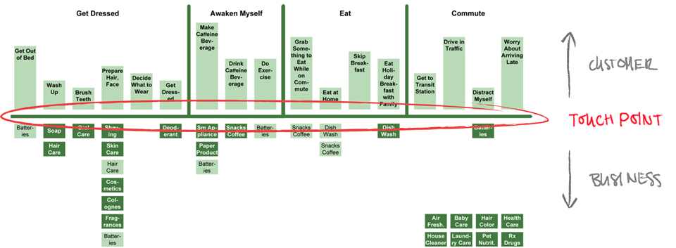
Here's one of James Kalbach's examples:
Basic Visualization Guidelines
- Each visual should either ask an important question or prove a specific point.
- Provide a meaningful title.
- Don't name the data. Ask the question the visual answers or draw the conclusion the data warrants.
- Not, The Cost of Wrapping Paper by Month, but rather Buy Wrapping Paper in January
- Don't decorate your charts.
- Keep the signal to noise ratio as close to 1::0 as possible.
- Don't use more than 5 colors at a time.
- Use high-contrast to identify the main point.
- Don't label things in different directions -- don't make people tilt their head to read.
- Label the axises clearly and honestly.
- Label data internally rather than using a key whenever possible -- a key makes a person's eyes jump back and forth.
- In the digital realm, take advantage of onHover and onClick techniques.
- In the digital realm, make the graphics interactive whenever possible.
- People love to slide and click and turn around objects on a screen.
- Provide a source line and a link to the data
- If the chart of graph requires more than 15 seconds to understand, send it to your audience's personal screens or provide a printout and give them time to understand what they are looking at.
- You shouldn't have to explain a chart. If during rehearsal you hear yourself saying, "As you can see", rethink how you are presenting.